UI Text Entry Box
Overview
The UI Text Entry Box object allows creators to provide a way for players to enter text. This could be used for taking a quiz, naming a pet, or even a text adventure game. The creator can capture the changed and submitted text and do with it what they need from there.
Use Cases
There are many use cases as to why creators would want to provide a text field for players to enter text. Below lists a few ideas of how it could be used.
-
Customization
Players can name things (for example, a Pet) which allows for more customization.
-
Searching
A search feature (for example, an Inventory) allows players to find things quicker than just scrolling through long lists.
-
Text Adventure Games
Text-based adventure games that allow players to enter commands to move through the world.
-
Command Panel
Instead of using the Chat API, the text entry object could be used to capture commands.
UI Text Entry Box Object
The UI Text Entry Box object can be added to the Hierarchy from two places.
Core Content Window
In Core Content under UI Elements, the UI Text Entry Box can be found and dragged into the Hierarchy.
Create Menu
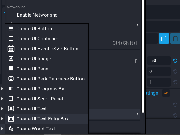
When right-clicking in the Hierarchy, creators can filter the menu and find the Create UI Text Entry Box item.
Properties
Below are some of the properties for the UI Text Entry Box. Other properties not listed are similar to other controls (for example, font color, size, dock, visibility).
| Property | Description |
|---|---|
Is Hittable |
If true, the cursor will be able to interact with this object. If false, the cursor won't be able to interact with this object. |
Is Interactable |
Whether text control is enabled. |
Is Multiline |
The text field can span multiple lines. |
Image |
The background image of the control. |
Prompt Text |
If provided, displays prompt text when the text field is empty. |
Background Color |
The base color of the control. |
Hovered Color |
The color when the cursor moves over the control. |
Active Color |
The color when the user is editing the control. |
Disabled Color |
The color when the control is disabled. |
Selection Color |
The color of the text selection when highlighting all or part of the string. |
Only Use Background Color |
If true, ignores Hovered, Active, and Disabled colors. |
Behavior
At runtime, a UI text entry box object that is interactable can be clicked on with a mouse.
When not being interacted with, the UI text entry box object is in its background state. If the UI text entry box object is empty and Prompt is true then the default text (using Prompt Color) is displayed. If the user has entered text or the creator has applied non-prompt text, then that text is also displayed.
API
The UI Text Entry Box has an API that can be used to change various properties and get property information. Two useful events can be used to detect any text changed and also detect when the text has been committed.
Below is an example of how to check the changed text as the user is typing, and also when the text has been committed. The committed text means the player has pressed enter (multiline is off), or they have unfocused the text box by clicking outside of it.
-- Client Script

-- Reference to the text entry box
local TEXT_BOX = script:GetCustomProperty("UITextEntryBox"):WaitForObject()

-- Enable cursor interaction and make visible
UI.SetCanCursorInteractWithUI(true)
UI.SetCursorVisible(true)

local function OnTextChanged(obj, text)
    print("Text Box Changed:", text)
end

local function OnTextCommitted(obj, text)
    print("Text Box Committed:", text)
end

-- Connect text entry events
TEXT_BOX.textChangedEvent:Connect(OnTextChanged)
TEXT_BOX.textCommittedEvent:Connect(OnTextCommitted)
Learn More
UI Editable Text API | Pet Namer Tutorial | UI Text Entry Validation Tutorial

